Kevin Bates
Data-driven strategist turning insights into impact
This project is maintained by kevinjbts
About Me
Hi, I’m Kevin — a former strategist and startup advisor turned data analyst, passionate about helping teams make smarter, data-driven decisions. Over the past 8+ years, I’ve led strategy and analytics projects across industries, combining technical tools like Python, SQL, Tableau, and Power BI with business expertise to bridge the gap between data teams and decision-makers. My portfolio showcases real-world projects focused on turning data into impact through clear visualizations, streamlined reporting, and actionable insights.
I specialize in:
- Data Analytics & Visualization: Using SQL, Tableau, and Python to extract insights and craft dashboards that inform strategic decisions.
- Project Management & Strategy: Leading cross-functional initiatives to align data science projects with business objectives.
- Business Growth & Innovation: Supporting decision-making through data-driven solutions for scalability, operational efficiency, and financial growth.
Certifications
- Microsoft Azure Fundamentals, Datacamp
- Workflow Specialist, Asana
- AI in Healthcare, Stanford
- Github Foundations, Datacamp
- Google Data Analyst, Coursera
- Data Analyst, Datacamp
- SQL Fundamentals, Datacamp
- dbt Labs, dbt Fundamentals
- Data Analyst in Tableau, Datacamp
- Basic Proficiency in KNIME Analytics Platform, KNIME Analytics Platform
Recent Data Reads
- “AI Survival Guide” - Sol Rashidi
- “Ace the Data Science Interview” - Kevin Huo & Nick Singh
- “Confident Data Skills” - Kirill Eremenko
- “Numsense! Data Science for the Layman” - Annalyn Ng
Portfolio Projects
Listed below are a selection of portfolio projects. Click into each project for the full write-up and code.
Movie Correlation
Skills: Pandas, Numpy, MatplotLib, HeatMaps
Utilizing an Alex the Analyst project, utilized the IMDB movie database to understand correlation between features for movie performance.
Sample Customer Analysis
Skills: MatplotLib, Tableau
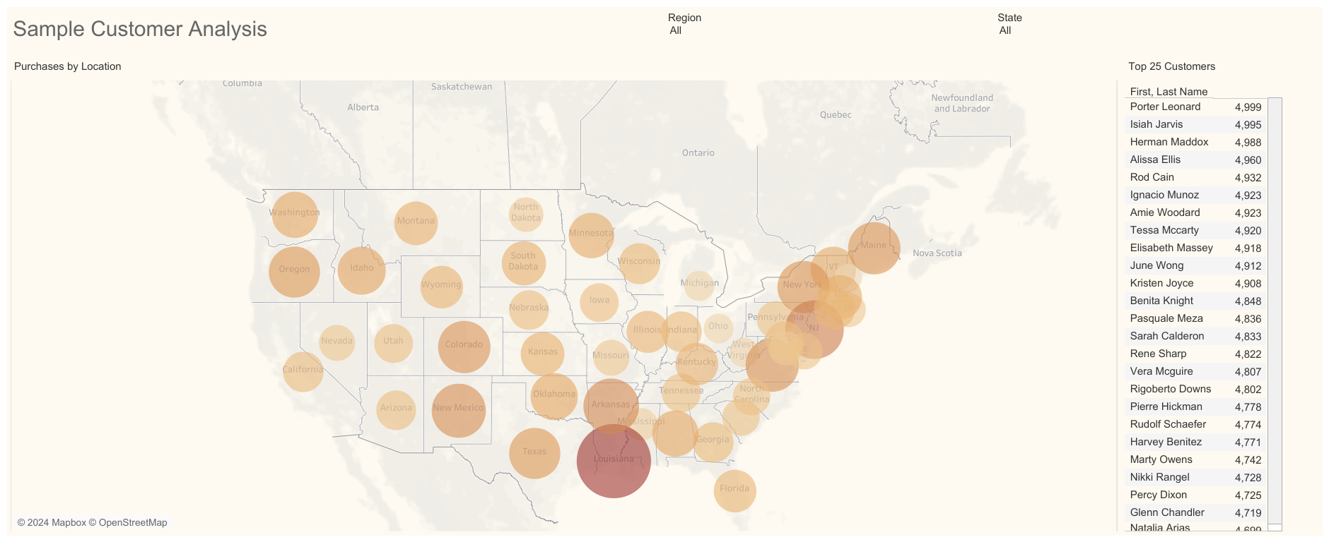
Using Pandas in Python, generated a sample customer list and transaction data, exploratory analysis for insights, visualizing in Matplotlib - and created an interactive dashboard in Tableau for stakeholder consumption.
AirBnb-EDA
Skills: Tableau
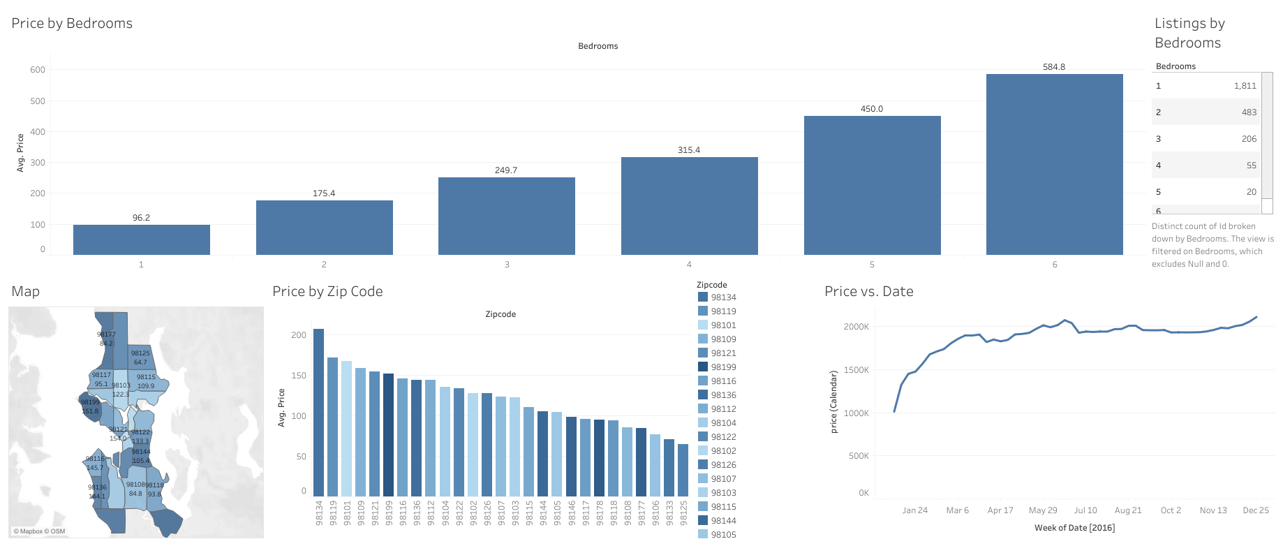
Analyzed data from the Zero AirBnB dataset (focused on Seattle, Washington). To understand key insights and due dilligence for opportunity of entering AirBnB rental business in the area.
E-Commerce Dashboard
Skills: Tableau
As part of of the Corporate Finance Institute, Business Intelligence & Data Analyst Certification, created a Tableau dashboard for a fictional e-commerce company.